


Don't Create Crappy Slides, It Will Kill Your Reputation
Don't Create Crappy Slides, It Will Kill Your Reputation
You want your audience to listen to your content, not fall asleep


This is a free newsletter from Learning & Development Rocks.
Most people create such tedious and soul-numbing presentations that their audience wants to jump face-first out of the window.
And no one can get away from delivering presentations. No one.
If you want to climb the corporate ladder or succeed in business you must learn how to deliver exciting presentations, and that way you'll be ahead of your competition.
So, what makes a good presentation?
In addition to knowing what message you want to get across and using your voice and body language to your advantage, you have to have interesting slides.
Slides are a teaching aid, not a presentation. Alongside handouts, photos, the whiteboard, flip charts, and quizzes, slides help you get information out of your head and into your audience's.
If you want to bore your audience, dump your thoughts onto a slide deck and read them through. It'll be easy for you, but your audience will want to gouge out their eyes with a blunt spoon.
They'll be disengaged, disenchanted, and dissing you.
And they'll always remember your presentation but for the wrong reasons.
So, let's address the elephant in the room:
Are slides even necessary?
In the corporate world, the answer is "yes." Executives, team members, and stakeholders expect a slideshow when they attend a presentation. If you don't provide one, your audience will be taken aback, and that will impact your message.
In my four decades of corporate life, I've never seen a presentation without slides. And as a Learning and Development Manager, I've spent untold hours teaching people how to create slides that work.
The hard truth is that you can't avoid delivering presentations, and you can't avoid creating slides.
So you may as well learn the mistakes to avoid. Luckily, anyone can do that.
Here they are:
1. Making the Best Boy Dolly Grip the Star of the Show
I've been to heaps of presentations where the presenter stood up, read the slides, and asked if there were any questions at the close.
The audience tapped away on their phones and laptops, asked for a copy of the presentation to read it later at their desk. If ever.
Did the audience hear the message?
No.
Are they likely to come to your next presentation?
No.
People are too busy to sit and listen to someone read out slides. Slides are a useful accessory, not the presentation, so use them as such.
The more your audience engages with the content, the more likely they will remember it. A well-placed question on a slide can create a moment of reflection or discussion, breaking up the presentation and making it more interactive.
Include a quiz, a quick poll, or a thought-provoking question to get your audience involved.
Make your slides work for you, not against you.
Action points:
Use slides to emphasize key points, show visual data, or illustrate a story or metaphor.
Remember, they are there to back you up, not to replace you.
Design slides with:
One or two words
A question
A picture
A quiz
A poll
A graph
A simple takeaway
This way, you and your expertise are the stars of the show, not the slides.
2. Crowding Slides Like the Food Table at a Hobbit's Birthday Breakfast
Another common mistake is cramming too much information onto a single slide. This might seem efficient, but it's not, it's frustrating.
Last year, I attended a community meeting, and one of the speakers gave a presentation about house sales in the area. What she said was interesting, and her slides had heaps of charts and graphs packed with information, but no one could read them.
She spoke well, but there was too much information to remember. We asked if there were handouts, but there weren't.
I asked for a copy of the presentation, but I couldn't open it when it arrived in my inbox.
When you've got your target audience in front of you, please make the most of it by making your slides work for you, not against you. The presenter at the community evening had masses of valuable information to impart, but I was frustrated that I couldn't access it rather than grateful that she had collated it.
Here’s an example of an overcrowded graph:
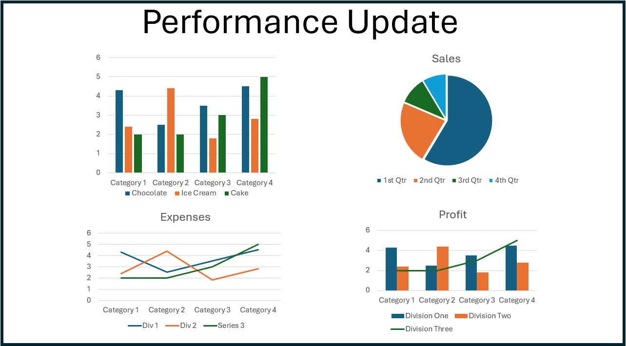
I’ve seen many overcrowded slides like the one above, where no one can read the captions or make sense of the information.
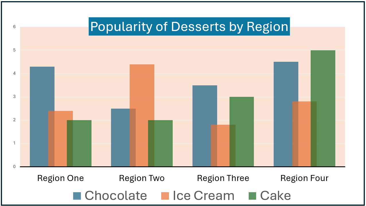
Instead create one slide per graph like the one below. Make sure the graph fills the page. Enlarge the captions so your audience can read them.
Action points:
Simplify.
Use big, bold writing that everyone can see from the back of the room
Never use more than five lines of text on a slide
Limit yourself to one idea per slide
Only put one chart or graph on each slide
Provide handouts (digital or hard copies, depending on your audience) containing all the details and copies of any charts or graphs
This might mean you end up with more slides, but that's okay. It's better to have 20 simple, clear slides than five overloaded ones.
3. Creating Slides Less Interesting than an Accountant's Dream Job
Humans need to be entertained. At a presentation, we also need to be inspired to listen to the speaker and take the message on board.
We want a bit of a show with our learning.
I'm an extrovert, and never had any trouble entertaining my audience. If anything, we made too much noise with all the laughter. You don't have to be an extrovert to keep your audience engaged, but you do have to provide some interest.
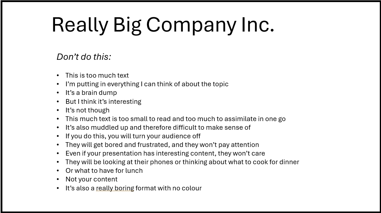
Slides with nothing but text like the one below are boring, unimaginative, and uninspiring.
Early in my career, I engaged a lawyer to give a presentation to a group of managers. It was a day-long presentation, and all he did was read the slides. It was so dull that people got up and walked out, saying it was a waste of time.
Your presentation could contain groundbreaking ideas, but you're wasting your breath if no one listens.
You need to add a bit of oomph or ooh la la, and you do this by adding color and images as in the image below.

Action points:
Use plenty of pictures, colors, and diagrams to break up the text and add visual interest
Choose relevant images for your content and help tell the story you're sharing
Stick to a consistent color scheme and style to create a cohesive look
Ensure that the visual elements are appropriate for the topic at hand; a presentation on cybersecurity, for example, might use sleek, modern graphics, while a team-building presentation could use more playful, colorful visuals.
Mix up the format by using variations on layouts
We humans get bored without variety, so make sure you provide it in a workplace presentation where people least expect it.
Bonus tips
Avoid:
Slide transitions that are too fancy - your audience will be looking at the transitions and wondering how you did them, rather than listening to you
Too many sound effects or memes - they distract your audience from the key message
Overly bright or clashing colors - they are too hard on your audience's eyes
Low-quality images - they make your slides look unprofessional
Cartoons - they can appear childish and patronizing unless they fit with the organizational culture
Takeaways
You need to learn to create slides that help you get your message across, rather than hinder you.
Use slides as a tool to prompt you - remember, you are the star
Keep your slides simple
Use color, graphics, photos, and images
Here's a free Slide Deck Audit to help you create your next presentation:
If you found this post useful, please share it so I can be of use to other people too.
Remember to click the subscribe button, that way you’ll never miss a post :-)
🤗🤗🤗